Thursday, 13 May 2010

Final Production

This is my front cover for my main task.


This is my contents page for my main task.


This is my double page spread for my main task.


This is my front cover for my preliminary task.


This is my contents page for my preliminary task.

Wednesday, 14 April 2010

Task 18


1. In what way does your media product use, develop or challenge forms and conventions in real media products?
My media product uses forms and conventions through out the project. The picture above is my magazine front cover that I have produced on Photoshop. The similarities of my front cover compared to other front covers are shown on my project. My masthead is big, and you can tell that my title is ‘Upbeat’; this follows the conventions in real media products, as their masthead is big too. Also my contents production and double page spread follow the conventions, however, they challenge forms as real media products look more professional as they have subscriptions and other small niceties included in their contents and double page spread. Below show’s my media product and how I have used, developed and challenged forms and conventions in real media products.


This is my media magazine front cover that I produced on Adobe Photoshop, my title is ‘Upbeat’ and this follows the conventions as every magazine has a large masthead on it. Also I have followed conventions by using an issue number, price and barcode.


This is my contents page that I produced on Quark Express. I followed the forms and conventions as I included a lot of content and pictures to go with the content. I also included an editor’s letter with the contents page, which shows I followed the conventions.


This is my double page spread which I also produced on Quark Express. I followed the conventions on this production as I used a relevant title and a stand first/by line. Also I followed the conventions by using a relevant picture and a drop capital.


I chose to use this font for my title because I think it would relate to my audience as it’s big and bubbly. The font is also curvy which relates to my audience because it seems more social.


This is a front cover from vibe magazine, and this shows a big masthead and also shows a central image which is direct mode of address. I have also used a big masthead and central image, following the codes and conventions.


2. How does your media product represent particular social groups?

My media product represents particular social groups as my genre for my magazine is hip hop. My music magazine is for people who enjoy hip hop music. For my front cover, I used a teenage boy as I think he would represent people who enjoy hip hop music, more teenagers and young adults enjoy this sort of music more than older adults and the elderly. The colours I used are blue and purple and this shows that these colours relate to the music genre hip hop.

http://www.youtube.com/watch?v=oVaAzWgWtnw

This link is to a YouTube video, which shows Black Eyed Peas’ fans going crazy and as you can see on the video, they enjoy hip hop music and the audience are also teenagers and young adults.


3. What kind of media institution might distribute your media product and why?
IPC media may distribute my magazine because it differs to the magazines they already publish. I think IPC would be a good institution for my magazine as they don’t already publish a magazine that has the genre hip hop and that is published monthly. I’d be making the range of genre’s IPC publish wider, and I think this would be a good idea because it will be a higher profit for the company. This institution is a very well known publisher. Statistics show that 26 million adults in the UK read a magazine published by IPC media. Because they are such a well known company, there should be more advertisement options.

http://www.ipcmedia.com/


4. Who would be the audience for your media product?


The audience for my magazine is for teenagers and maybe young adults between the ages of 18-23 of both genders. Also the audience for my genre of magazine would have to be people who enjoy hip hop music and who have an interest in hip hop. Below is one person who would be a member of my target audience and enjoys hip hop music.


Name: Felicity Walker
Age: 17


Gender: Female
Occupation: Sales assistant/ full time student


Favourite music: Hip hop/Rihanna/Beyonce
Hobbies/Interests: Socialising, with friends


Favourite colour: pink

Favourite genre of music: hip hop

Favourite tv programme: hollyoaks

Shops: New look

Artist: Beyonce

Favourite school subject: Art

Hobbies: Socialising


5. How did you attract/address your audience?
I attracted my target audience by using colours I thought would attract teenagers and young adults. I used blue and purple as these colours will address boys and girls and not just one gender. I also attracted my audience by including hip hop artists and also artists who are popular in the charts and people enjoy listening to, such as Lil Wayne and Beyonce. Also I attracted my audience by using questionnaires and asking questions related to my genre of music which is hip hop. By using an informal tone in my magazine product, this may encourage my target audience to read, as it’s easy to understand. By using different typefaces, on the front cover, I think it will attract a younger audience by using more softer and curvy fonts.


THIS COLOUR THIS COLOUR


6. What have you learnt about technologies from the process of constructing this product?
For my project I used media programs called Adobe Photoshop and Quark Express and I created my magazine project. I used photo’s that I had took myself for my production and edited them to fit in with my project. I used Quark to create my contents page and also my double page spread. Adobe Photoshop was used to create my magazine front cover. Below are print screens of my work and what I learnt about the technologies. I have also learnt a lot about editing, and using different colours.


In Photoshop I learnt to use the tools such as the Move tool, Lasso tool, Crop tool, and many more tools to help me with my production.


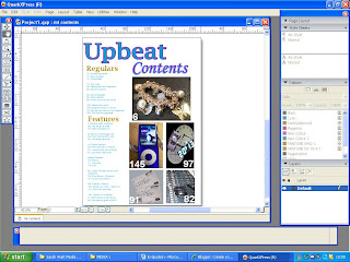


For my contents page I used Quark Express and I learned to use all different tools such as text box and import picture. I also learnt to make my own colours and also the colours I used in Photoshop I could use in Quark. This was the same for my double page spread, as shown below.


7.Looking back at your preliminary task, what do you feel you have learnt in the progression from it to the full product?
I feel like I have learnt a lot more producing the full product than my preliminary task. I feel like my front cover of my full production is a lot better than my front cover in my preliminary task as my front cover connoted my genre of music. Also the contents page is a lot better as for my preliminary I lost my contents page and only had a limited amount of time to fix it. I feel that I have a lot better in the full production than in the preliminary task.
This is my preliminary task:


This is my front cover that I produced for my preliminary task, and compared to my main task, I think I have developed more skills, and used more coverlines to show a professional product.


This is my contents page that I produced for my preliminary task. I think that the contents page I produced in my main task was a lot better than my preliminary as it included more content and pictures, also the layout was more professional.


This is my front cover for my main task and compared to my preliminary task I think this a lot better and I have developed my skills for photoshop a lot more.


This is my contents page that I produced for my main task, and compared to my preliminary task I have developed more skills, and used more content and made the contents look more professional.


Sunday, 11 April 2010

Task 17

1./ Would you buy my production?


You can see 5 people would buy my production and 5 people wouldn’t.


2./ Do you like the use of colours?


You can see that 7 people liked the colours I used and 3 people didn’t.


3./ What do you like about my magazine?


You can see that most people liked my images that I used on my production.


4./ What do you dislike about my production?


You can see most people dislike the colours I used on my production.


5./ Do you think there are enough cover lines and information on the front cover?


Most people thought I had enough cover lines on my production.


6./ Do you think the age range 16-21 is appropriate?


All my participants thought the age range, 16-21 is appropriate.


7./ Would you pay £2.00-£2.50 for my magazine?


Most people wouldn’t pay £2.00-£2.50 for my production.


8./ Do you think the pictures on the contents page are appropriate?


9 out of 10 people thought my pictures were appropriate for my production.


9./ Do you think the image used on my double page spread is appropriate for the title?


Also 9 out of 10 people thought my image for my double page spread was appropriate.


10./ If you could change anything on my production, what would you change?


You can see that my 10 participants would change all different things on my production.


Task 16

Task 16 questionnaire
1./ Would you buy my production?
2./ Do you like the use of colours?
3./ What do you like about my magazine?
4./ What do you dislike about my production?
5./ Do you think there are enough cover lines and information on the front cover?
6./ Do you think the age range 16-21 is appropriate?
7./ Would you pay £2.00-£2.50 for my magazine?
8./ Do you think the pictures on the contents page are appropriate?
9./ Do you think the image used on my double page spread is appropriate for the title?
10./ If you could change anything on my production, what would you change?

Sunday, 21 February 2010

Task 15

This is my front cover that I produced on Adobe Photoshop:


This is my Contents page that I produced on Quark Express:


This is my Double page spread that I also produced on Quark Express:

Wednesday, 9 December 2009

Task 14

This is my rough sketch of my double page spread.


Task 13


This is the image I chose to use on my front cover.

I took several images for my front cover, contents and double page spread. I decided on a central image where the model was looking at the camera and pretending to 'be' a DJ on the radio decks. The direct mode of address in this picture is one of the codes and conventions of magazines of this genre. Other images that I had taken, I chose to keep incase I wanted to use them on something else such as my contents page or double page spread.


I didn't use this image because the direct mode of address is not the sought I personally would use for a central image. However, this image could be used in the contents page as a smaller image to connote the front cover.